Brand Kit & Color System
Logos, color system, typography, and design decisions for Source Library. This page documents the current state, open questions, and proposed alignment.
Logo Configurations
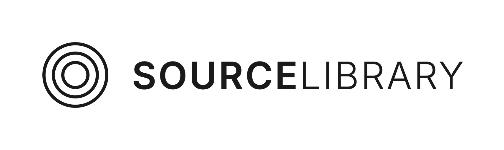
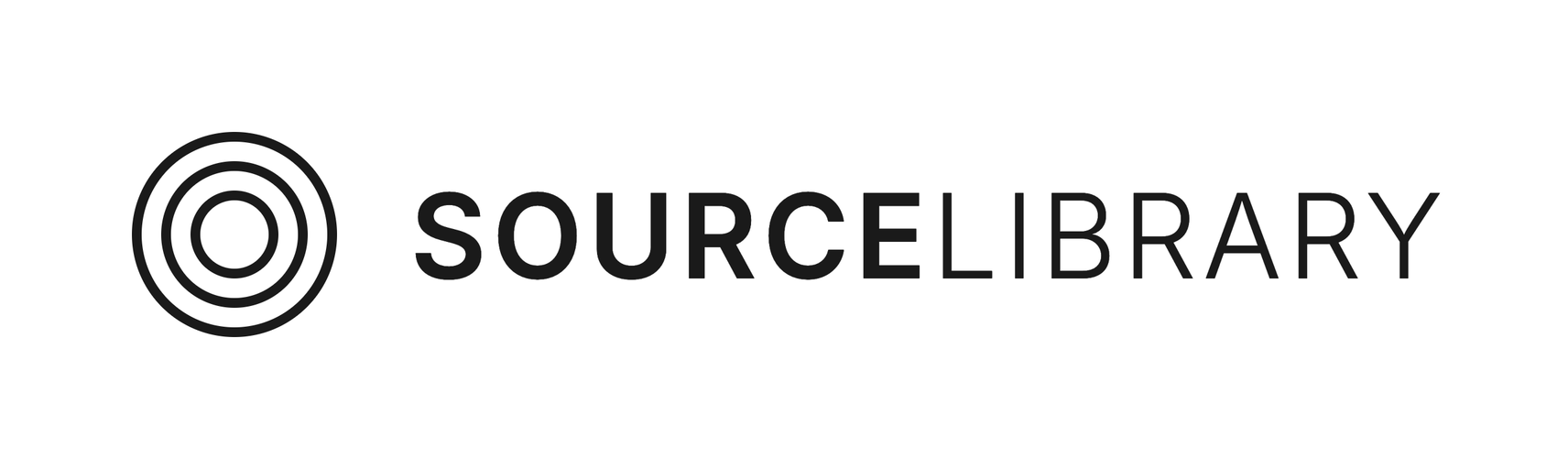
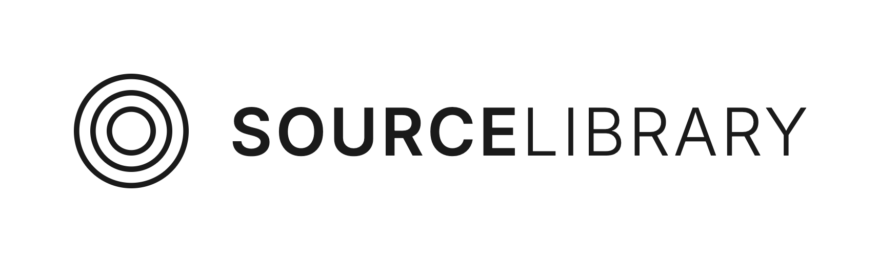
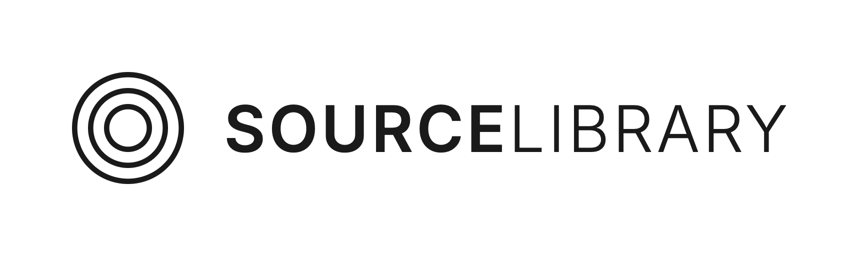
Full Logo
The primary logo. Use this wherever space allows.
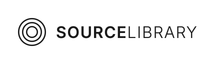
Compact Logo
Smaller variant for tight spaces, navigation bars, and mobile.
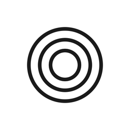
Icon Only
The concentric circles mark. Use for favicons, app icons, and avatars.
Wordmark Only
Text-only mark. Use when the icon is already present or for inline references.


Stacked Logo
Vertical layout. Use for square formats, social media profiles, and print.
Color System
Two color systems coexist: CSS design tokens (used in ~35 files) and raw Tailwind utilities (used in ~117 files). This section documents both, proposes alignment, and flags decisions needed.
Brand Accents
Five named accent colors defined as CSS custom properties in globals.css. These are the intentional, curated palette. Defined in @theme inline so they work as both var(--accent-rust) and Tailwind text-accent-rust.
Rust
--accent-rust: #9e4a3a
Links, annotations, prose accents. Used in 12 files.
Gold
--accent-gold: #c9a86c
Decorative, search highlights, logo flame. Used in 5 files.
Sage
--accent-sage: #8b9a7d
OCR/AI features, processing states. Used in 6 files.
Slate
--accent-slate: #546b8a
Defined but never used in any component. Remove?
Violet
--accent-violet: #7c5db5
AI assistant, explain features, annotations. Used in 7 files.
Action Color: Amber
The dominant interactive color. Used via raw Tailwind classes across 93 files (479 occurrences of amber-600 alone). Buttons, CTAs, hover states, focus rings, loading spinners, badges. Not defined as a design token — used directly as Tailwind amber-*.
50
100
200
300
400
500
600
700
800
Primary action shade: amber-600 (#d97706). Hover: amber-700 (#b45309). Subtle backgrounds: amber-50, amber-100.
Amber vs Gold — are these the same color?
Amber-600
#d97706
≠
Gold token
#c9a86c
These serve different roles. Amber is saturated and high-energy — used for clickable actions. Gold is muted and warm — used for decorative/ornamental purposes (search highlight backgrounds, flame accents). See decision below.
Backgrounds & Surfaces
The warm paper aesthetic is a signature look. Cream backgrounds with subtle warm shifts.
Cream
--bg-cream: #fdfcf9
Primary page background
Warm
--bg-warm: #f5f0e8
Cards, panels, elevated surfaces
White
--bg-white: #fff
Input fields, modal backgrounds
Dark
--bg-dark: #1a1612
Header, hero, dark sections
Signature Gradients
#fdfcf9 → #f5f0e8
Page fade (cream to warm)
#f6f3ee → #f3ede6
Section backgrounds
#1a1612 → #2a2520
Dark header gradient
Dark color inconsistency
CSS token
#1a1612 (warm)
vs
Brand assets
#1a1a1a (neutral)
vs
Hero overlay
#000000 (pure)
Three different “dark” values used across the site. See decision below.
Text Hierarchy
All text colors meet WCAG AA 4.5:1 contrast on cream/white backgrounds.
Primary
--text-primary: #1a1612
Headings, body text
Secondary
--text-secondary: #444
Subheadings, supporting text
Muted
--text-muted: #6b6560
Captions, metadata (5.2:1)
Faint
--text-faint: #8a8480
Timestamps, hints (4.5:1)
Borders
Light
--border-light: #e8e4dc
Card borders, dividers. Used in ~32 files.
Medium
--border-medium: #d4cfc4
Stronger separators, input borders. Used in ~10 files.
Neutral Palette: Stone
The structural/neutral system. Used via raw Tailwind classes across 117 files. Backgrounds, borders, text, cards — the foundational gray scale.
50
100
200
300
400
500
600
700
800
900
Semantic Colors
Standard UI states. Used via raw Tailwind classes. Not design tokens — this is fine.
Green (Success)
52 files. OCR/translation complete, pipeline done, success.
Red (Error)
46 files. Failed jobs, errors, delete confirmations.
Blue (In Progress)
41 files. Running jobs, processing, informational.
Yellow (Warning)
8 files. Pending, warnings, highlights.
Other Colors in Codebase
Tailwind colors used in scattered spots. These are not part of the design system but appear in specific components.
purple-* — annotations, experiment variant B
rose-* — annotation type colors
teal-* — scattered, minor usage
emerald-* — alternative success states
sky-* — scattered, minor usage
Decisions & Proposals
The color system works but has inconsistencies. Below are the open questions with proposed resolutions based on actual codebase usage data.
1. Amber vs Gold: keep both?
ProposalProblem
Amber-600 (#d97706) is used for all interactive elements (93 files, 479 occurrences). Gold (#c9a86c) is a separate muted warm used decoratively (5 files). They look different but both occupy the 'warm accent' space.
Proposal
Keep both. They serve distinct roles: Amber = action (buttons, links, CTAs), Gold = ornament (decorative highlights, logo flame). Trying to consolidate would mean either dull buttons or garish decorations. Document the distinction.
Evidence
Amber has 93 files of usage vs Gold's 5. Replacing either would touch hundreds of lines for no UX improvement.
2. Dark background: which black?
ProposalProblem
Three 'dark' values: #1a1612 (warm brown-black, CSS token), #1a1a1a (neutral, brand assets), #000000 (pure black, hero overlay). These are visually similar but inconsistent.
Proposal
Standardize on #1a1612 (the warm brown-black). It matches the warm paper aesthetic of the entire site. Regenerate brand assets with this value. Pure black can stay for overlay gradients where it fades to transparent.
Evidence
--bg-dark: #1a1612 is the intentional design token. #1a1a1a was a shorthand that crept into the brand kit. The warm tone is consistent with cream/warm backgrounds.
3. Remove --accent-slate?
ProposalProblem
--accent-slate (#546b8a) is defined in globals.css but never used in any component, page, or stylesheet.
Proposal
Remove it. Zero usage means it's dead code. If a blue-slate accent is ever needed, it can be re-added with actual usage.
Evidence
Grep of entire codebase: 0 files reference --accent-slate or text-accent-slate outside globals.css definitions.
4. Warm gradients in brand guidelines?
ProposalProblem
The warm cream gradients (#fdfcf9 to #f5f0e8, #f6f3ee to #f3ede6) are a distinctive visual signature but aren't documented anywhere.
Proposal
Yes, include them. They're as much the brand as the logo. Document the 3 signature gradients: page fade (cream to warm), section backgrounds, and dark header.
Evidence
The paper-like warmth is what distinguishes Source Library from generic websites. Every reader page, search result, and book card uses these tones.
5. Scope of this page
ProposalProblem
Should the brand page be a minimal logo kit, or a fuller design system reference?
Proposal
This page: logos + full color palette + typography + key visual patterns. Not a component library. Enough that a designer or second developer can build consistent UI without reverse-engineering globals.css.
Evidence
The codebase already has a collaborative dev (per CLAUDE.md). This reference prevents color drift and documents the intent behind each token.
6. Two color systems: consolidate?
Needs DecisionProblem
CSS vars (--accent-rust, etc.) are used in ~35 files. Raw Tailwind (amber-*, stone-*) in ~117 files. They overlap — stone-900 and --text-primary are nearly the same color.
Proposal
Don't consolidate now — the cost is too high (touching 117+ files) for minimal benefit. The @theme inline bridge already makes CSS vars available as Tailwind classes. Instead, prefer design tokens for new code and let raw Tailwind usage naturally decrease over time.
Evidence
109 files use only raw Tailwind with zero CSS vars. Migrating them all would be a huge refactor with risk of visual regressions and no user-facing improvement.
Typography
Logo Wordmark
Font: Inter (Google Fonts)
“SOURCE”: Semibold (600)
“LIBRARY”: Light (300)
Case: Uppercase
Tracking: 0.05em
SourceLibrary
Site Typography
Display / Headings
Playfair Display
Body / Reading
Newsreader — optimized for extended reading
Scholarly / OCR text
Cormorant Garamond — historical text display
UI / Navigation
Inter — clean, functional interface text
Usage Guidelines
Logo Usage
Use the full logo as the primary mark.
Use the icon only at small sizes or as an avatar.
Use white on dark on dark or image backgrounds.
Use black on white on light backgrounds.
Maintain clear space equal to the icon height around the logo.
Color Intent
Rust for literary/scholarly emphasis (links in prose, annotations).
Gold for decorative warmth (highlights, ornamental accents).
Sage for AI/technology features (OCR, processing).
Violet for AI assistant features (explain, summarize).
Amber for all interactive actions (buttons, CTAs, focus).
Visual Identity
The warm paper tones (cream, warm) are the signature look.
Prefer stone neutrals over pure gray.
Use subtle gradients for section backgrounds.
The overall feeling: a well-lit reading room, not a tech dashboard.
Design tokens are preferred for new code. Raw Tailwind for rapid prototyping.
Technical Reference
CSS Custom Properties
/* globals.css :root */
--bg-cream: #fdfcf9;
--bg-warm: #f5f0e8;
--bg-dark: #1a1612;
--text-primary: #1a1612;
--text-secondary: #444;
--text-muted: #6b6560;
--text-faint: #8a8480;
--accent-rust: #9e4a3a;
--accent-gold: #c9a86c;
--accent-sage: #8b9a7d;
--accent-slate: #546b8a; /* unused, remove */
--accent-violet: #7c5db5;
--border-light: #e8e4dc;
--border-medium: #d4cfc4;
Tailwind Theme Bridge
/* @theme inline makes these Tailwind utilities */
bg-cream, text-cream
bg-warm, text-warm
bg-dark, text-dark
text-primary, text-secondary, text-muted
text-accent-rust, bg-accent-rust
text-accent-gold, bg-accent-gold
text-accent-sage, bg-accent-sage
text-accent-violet, bg-accent-violet
border-border-light, border-border-medium
/* Plus all standard Tailwind colors */
amber-*, stone-*, green-*, red-*, blue-*, yellow-*
Brand kit generated by scripts/generate-brand-kit.mjs. Re-run to regenerate all assets. SVGs are potrace-traced outlines with no font dependencies.